Painting Walls [Part 2] — Emotional Power of Color

HUDSON BLACK

Photo | Abigail Ahern Paint Collection at Designer Paint

Each color has the power to evoke a particular emotion. One more point to consider when painting a room. Color can stimulate, soothe, charm, irritate, or depress and it would be painful to go through the work of designing a room, only to feel irritated in it.

Emily Post’s overview of the emotional behavior of color in, The Personality of a House is eye-opening.  Sometimes it’s difficult to pinpoint why a room makes us feel a certain way, but color rules emotions.

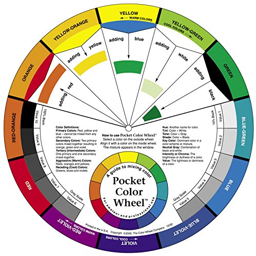
Color Wheel— the niftiest design tool in my tool box.

Yellow is the color of sunlight. It is the lightest color.  Yellows of every tone can be put together becomingly while remaining in perfect accord with each other.

Red expresses fire, energy, and primitive passion. Rrrrr. In its brightest tones, red is the most brilliant, stimulating and approaching of all colors.

Red with gray gives us a deep, wine-red.  If darkened with black and accented with yellow it creates a brown-toned crimson:  Old Italian Red,  which is richly warm, dignified, restful, friendly.  It is very becoming to a large, high-studded room with dark wood paneling and is the perfect background for large, weighty objects.

Yellow and red— Light and fire— produce orange and the most vivid blaze of heat and light.

Vermilion or scarlet is the strongest, brightest most exciting color that exists.  It affects people differently; those who love it are stimulated and revived by its cheering warmth.  Those who love it will try to add at least a touch of it somewhere, while those who don’t will feel it be jarringly violent.   It’s best when accompanied by a full range of creams, blacks, and browns.

Blue— not navy, but French or Italian blue is ice, the coldest, most formal, distant and retreating color.  Its intellectual restraint may seem like it would behave calmly under all circumstances. Instead, it is tough to manage.  One blue item such as a wall hanging or a sofa is charming, but as soon as another blue item gets placed in proximity there, is a fight between the two objects.  Blues do not mix well and change drastically with the change in lighting.

Green is the color of leaves and intended by nature to harmonize with every color, and it will do so if properly blended.  If using green, remember that flowers have a quality of texture which modifies their hue and greens come in many varieties of shade and tint.

Green tints and shades of the same family go well together.  Green is known as the most soothing color, and its endless variation of hues and shades and tints can be chosen to suit every mood.  However, it can be hideous and light absorbing if its shade is too dark, especially at night.

Brown may quickly get elevated to beauty or reduced to ugliness depending on how it’s dealt with.  It is an essential of beauty— brown is the color of earth, tree trunks; many people have brown hair, brown eyes or brown skin.  The trick with brown is that it is dependent on texture more than tone.  Most woods are brown and carefully selected wood is the most beautifying element of furnishing known to us.  However, it can get uglier than any other color when it is not balanced or finished properly.

Violet is composed of red and blue— fire and ice— which consume each other, leaving nothingness.  That’s why violet is the color mourning, the color of twilight.  The violet-gray-black hue is the color of shadows.

Violet is nearest to black, the heaviest color giving it the air of mystery.  Violet can get suffocating if used in unrelieved quantities on walls or furniture.  And yet, a skillfully crafted violet wall can create the effect of vast distance.  The risk is that the wrong lighting or furniture can create the sense of being shut inside of an Egyptian tomb.

My Choice In the past, my color choices were dictated by furniture or the style I wished to create.  I didn’t work with the emotional power of those colors. For my current project, instead of choosing a look, I want to pick an emotion and let it guide me to the right color scheme.  I still haven’t nailed the paint for my current project, sigh.  But my goal is to have it by next Monday so I can show you some photos! Do you notice how the colors in your house play on your emotions?  If so, leave a comment, I’d love to hear how color works on you. My next post is the last in this series on color.  Painting Walls: Part 3— For Personal Appearance will discuss how to choose wall colors that will flatter your appearance (or that of the homeowner).  I can’t wait to share it.

Painting Walls [Part 1]— Understanding Color

Ana Luísa Pinto 1

PHOTO | ANA LUÍSA PINTO | ♡ HER WORK

I wanted to write something brilliant, but paint is on my mind.  Seriously, those who’ve experienced the wiles of choosing a wall color know that the right paint is no quick stop at Lowes.

When it comes to the character of a house, color means more than style, form, and proportion.  It has the power to enchant and equal power to distress.  It creates a dull, drab and lifeless atmosphere as much as one that is lively, warm and beautiful.  No need to argue— color is important.

As I shuffle through dozens of color swatches and smear endless paint samples on my walls, I am still searching.  Searching for the hue to bring out veins from the surrounding wood paneling, to highlight the slate inlays, to avoid clashing with the travertine floor, and to serve as the perfect backdrop for furniture.  I want the walls to blend into the background, draw neither negative nor positive attention and disappear while illuminating everything around them.

How the heck can I do that?

Artists spend their lives immersed in color theory.  Not me, but I would like to demystify color by writing three posts to share some of the principles that I gleaned from my favorite decorator, Emily Post in her book, Personality of a House: The Blue Book of Home Charm just in case you too find yourself quizzically staring into the depths of a blank wall.

Color Values

colorwheel

Image | Moses Harris, 1766

Various tints and shades are called high and low values.  The true original color at full intensity is called middle value.

Colors mixed with white are called tints, while those mixed with black are called shades.

Each color on the chromatic chart is called a hue.  Royal blue and baby blue are the highlight and low light of the same hue.

There are three different ways to change a color: mixing it with another color changes its hue; mixing it with black or white changes its value; mixing it with its complement turns it pastel.

Complementary Colors

The complement of any color is the one directly opposing it on a color chart.  The complement of each color is the color that contains none of its own hues, red is the complement of green, a mixture of blue and yellow which contains no red.

The effect of complementary colors on each other is very interesting to experiment with.  They lose all brilliance if any portion of one is mixed with the other.  Vivid yellow and strongest violet mixed in equal parts creates neutral gray.  That same gray is produced by mixing blue with orange, or green with red, or any of the intermediate hues such as red-violet with yellow-green.

Putting complementary colors next to each other creates the most brilliant contrast possible to produce.

Complementary colors are like salt to food, if there is none of it in the composition of an interior it will lack flavor, but too much is unbearable.

Triad of Harmony

Yellow, red and blue; violet, orange and green; red-orange, blue-violet, and yellow-green and so on are each triad of harmony.  These triads are safe to combine if modified in quantity or intensity.

Triads are not to be used in equal parts and full strengths but rather combined with their own grayed hues, plus any mixture of white or black.  They should be softened or diluted in value or quantity so that the room does not hit you in the eye like an advertisement poster.

Color Zero

White and black; gold and silver are considered colorless.

Weight of Color

The weight of color balances the color scheme of the interior. Heavier color goes on the floor.  Lighter color goes on the ceiling, medium color between the two, on the walls.  If this order is reversed the room will seem to be turned upside-down.

The weight of color is measured by how near or far it is from yellow.  Yellow has the highest luminosity or light giving quality because it is the color of sunlight.

Color weights start with yellow than orange, green, red, blue and violet being the heaviest.  White and black are not colors, but no matter how almost white a tint or almost black a shade, it is still a color. Black-violet or purple is the heaviest because it is the darkest color possible, while the cream is the lightest color possible.

This is an overview of the basics of color for painting, my next post will focus on the emotions of color.  We feel a certain something when we walk into a room and it’s often hard to put our finger on the thing that triggers those emotions, Painting Walls: Part 2— Emotions of Color will discuss how color affects the emotional state of a room.


Sources: Personality of a House: The Blue Book of Home Charm by Emily Post

Living it Down— Comfortable Minimalism

bed2

Even a tiny studio can get comfortable, once you get comfortable with minimalism.

Minimalism half allures me. I like clean, open space, and disregard for mindless consumption, but empty homes with blank walls and sharp lines make me shiver a little. I like having scope for the imagination, things to roll my eyes over.

Aesthetics aside, minimalism grew practical after moving into this smallish 350 square-foot studio in Portland. For the first time, I realized how comfortable a small space can be. It took a while to figure things out, but in the end, I unraveled the mystery of maximizing space without sacrificing style.

I am on the verge of moving out, but before I leave, I want to share the big things I learned in this small space.

Less Is More

This overused phrase means exactly what it implies. Less junk means more space. It means shopping mindfully, canceling the Costco membership and buying only what is needed, when it is needed. I just stuck to one soap variaty, one shampoo instead of all of them. It was enlightening to find that one good bar of soap and my favorite shampoo will last many months. Once I use that up, I can get another. It’s the tiniest things that cause the most clutter.

Give and Get

The best way to avoid overcapacity is the habit of giving. The concept turned into a sort of rule: every time I buy something, I give something else away. Giving is the best way to keep any space alive. Not only is it ever changing, but there is strong energy that comes from giving and I always want to have that energy flowing through my home. Hoarding has the opposite effect. All of those deadlocked things are lifeless; they become burdens weighing down space and the people living in it.

Bath1Quality over Quantity

Focusing on quality allows at least eighty-five percent of all things sold to get crossed off the list. It makes shopping easier and things more enjoyable. Buying good quality usually costs more at first, but pays for itself seven times over. Quality lasts longer and saves the time, energy, and money of constantly having to replace the same thing over and over. Then, of course, it’s more pleasurable and if it gets tiresome, it can be passed on to someone else because many well-made things can last a lifetime. Poor quality quickly becomes an eyesore and you keep replacing it, because why not it was cheap and then starts the never-ending cycle of consumerism.

Color Consort

In a small space, color is important. Too many loud colors have this way of overwhelming a room and lack of coordination makes any space look like a bazaar. Even when there is not much stuff, the discord of color makes a room look cluttered. Subdued tones create a comfortable ambiance and sticking with natural hues makes everything flow.

studio5

Studio living was an enjoyable experiment, but I miss having space to really stretch out in. You know, to scream without alarming the neighbors.